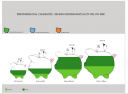

Typically, information is shown in a classical template; a bar chart, line graph, pie chart, etc. Such methods of displaying data have become so common that we often use them to communicate ideas, without first searching for a more successful means.
The goal of this project is to take you through the process of information visualization. Information design and visualization is a form of narrative. Each student approaches the information in their own way and generates a new and interesting concept to communicate traditional data sets.air track
The process of understanding data begins with a set of numbers and a
goal of answering a question about the data. The steps along this path
can be described as follows:
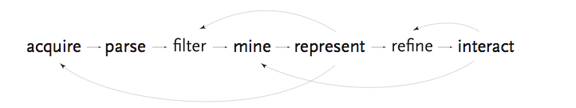 “The process of understanding data begins with a set of numbers and a
goal of answering a question about the data. The steps along this path
can be described as follows:
1. Acquire – the matter of obtaining the data, whether from a file
on a disk or from a source over a network.
2. Parse – providing some structure around what the data means,
ordering it into categories.
3. Filter – removing all but the data of interest.
4. Mine – the application of methods from statistics or data
mining, as a way to discern patterns or place the data in math-
ematical context.inflatable rodeo bull
5. Represent- determination of a simple representation, whether
the data takes one of many shapes such as a bar graph, list, or
tree.
6. Refine – improvements to the basic representation to make it
clearer and more visually engaging.
7. Interact – the addition of methods for manipulating the data or
controlling what features are visible.”
Ultimately this is fun, really. Data is surprising in its flexibility and overall squishiness as a design problem. There are so many ways to approach information presentation. Whether it is the friendliness of the illustrative style of Richard Saul Wurman, or the precise regulation of Edward Tufte, or the elegant intelligence of Minard, ultimately you are end up expressing your authorship as a designer and your understanding of your target audience though very subtle graphic cues that guide without getting in the way of illumination.
- Concept by Ben Fry
Project: Data Visualization, Class: Experience Design at RMCAD
Student Designers: Andrew Alger, Jenn Doe, Andrea Kilness, and Grant Miller
Instructor: Fred Murrell
See the projects here:
Andrew Alger, Andrea Kilness, Grant Miller, Jenn Doe